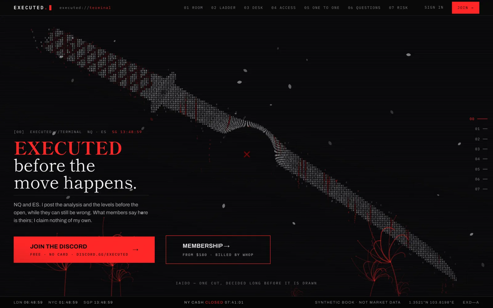
One typeface
Type
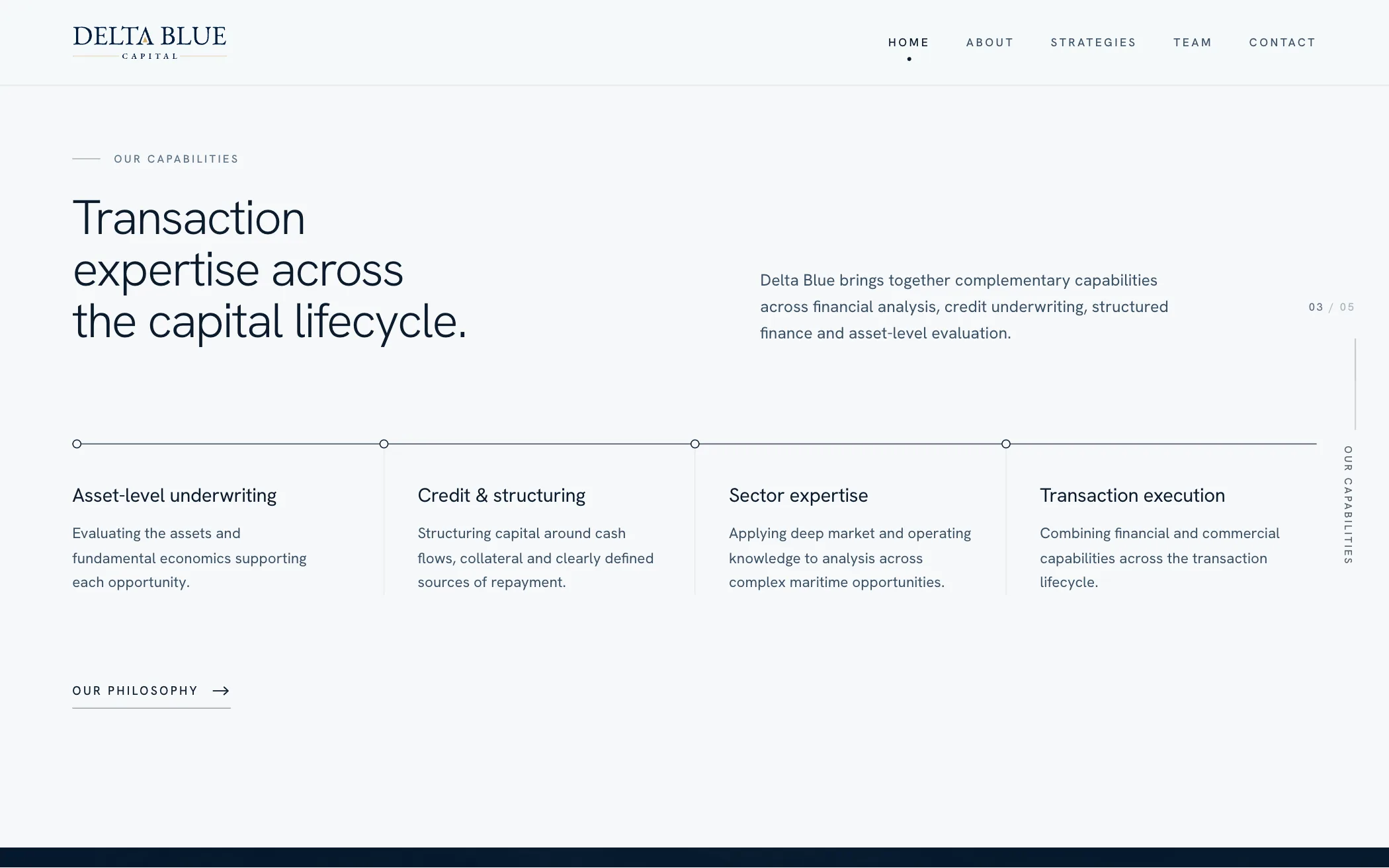
Hanken Grotesk and nothing else, with headings at its lightest weight. No serif and no monospace.
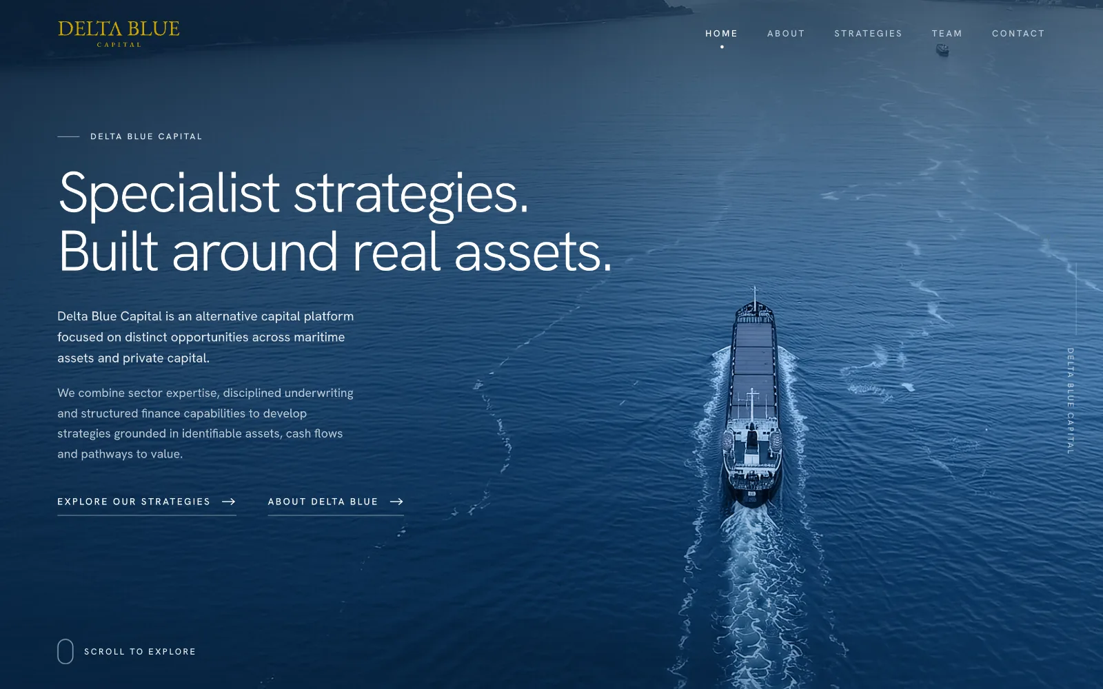
A capital platform working across maritime assets and private capital. The site is for someone who has already heard the name and is checking it.
Nobody finds a firm like this through a search. They hear the name in a meeting, from a referral or during a reference check, and then they look it up.
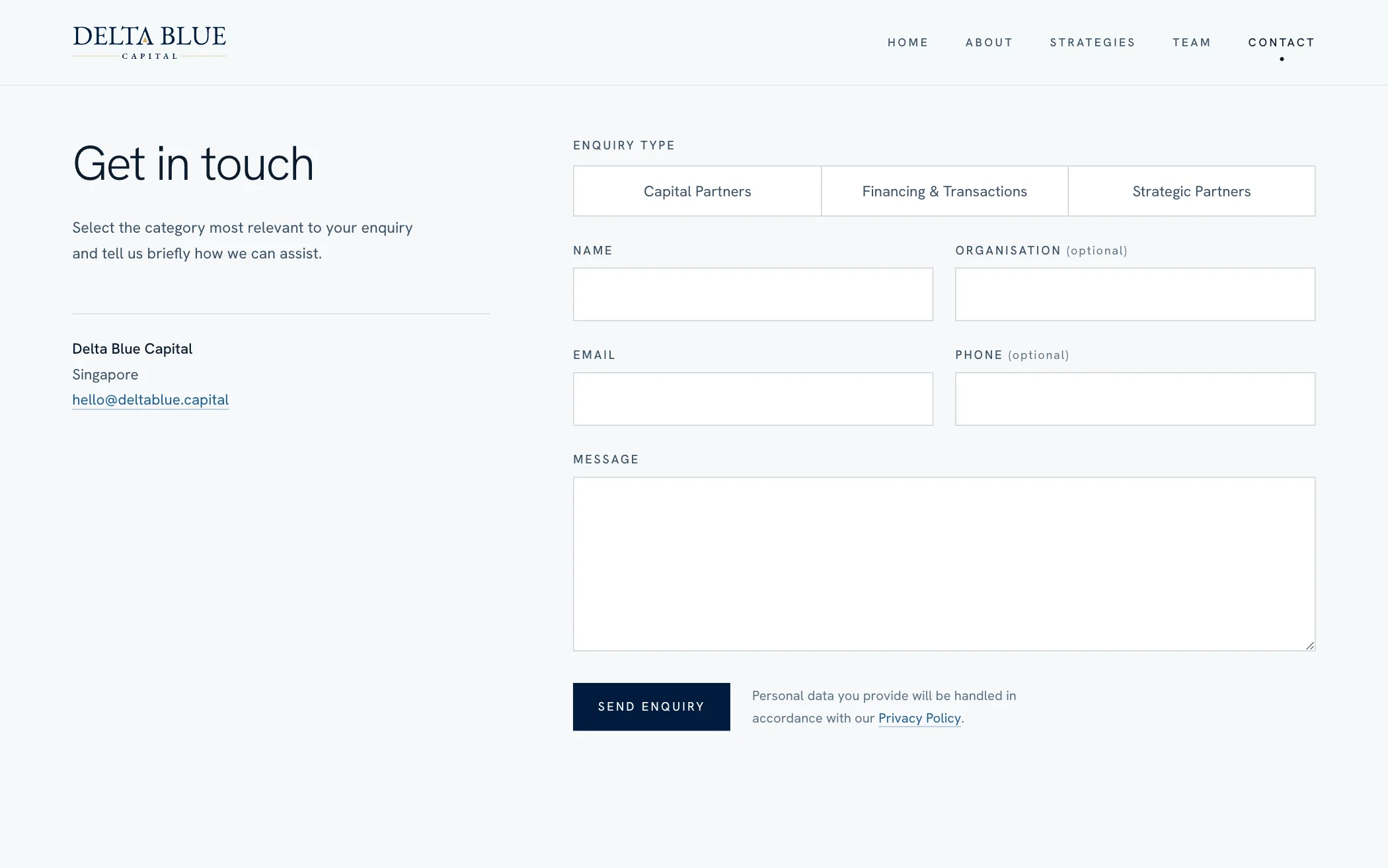
So the site is a credibility document. It says how the firm works, who runs it and how to reach it. There is no funnel and nothing to sign up for.
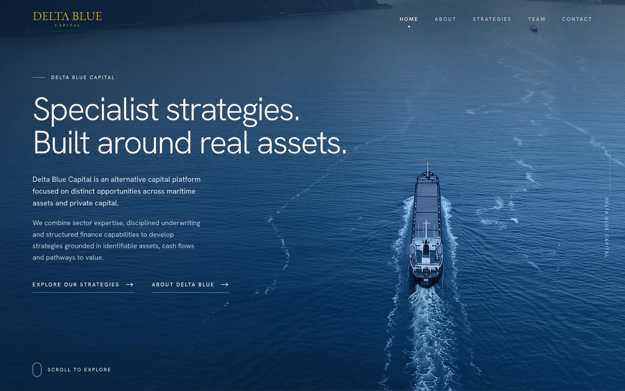
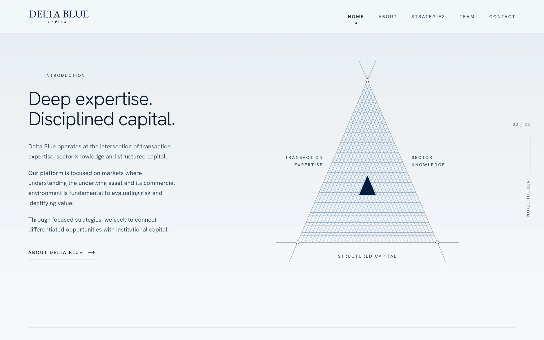
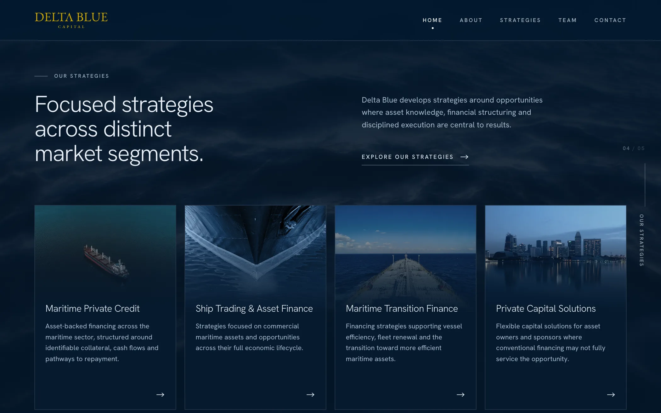
The usual corporate page is a hero, then sections, then cards. This one is a single maritime environment you scroll through: open sea, a chart, deep water, a course, a horizon.
Light paper sections alternate with deep-water ones, and each picture stays pinned while the next section slides over it. The pictures come from different photographers, so every one is desaturated and set under the same navy. They read as one sea.
One rule governs them: no readable vessel name, no hull number, no livery. Nothing on the page may suggest the firm owns a ship it does not.
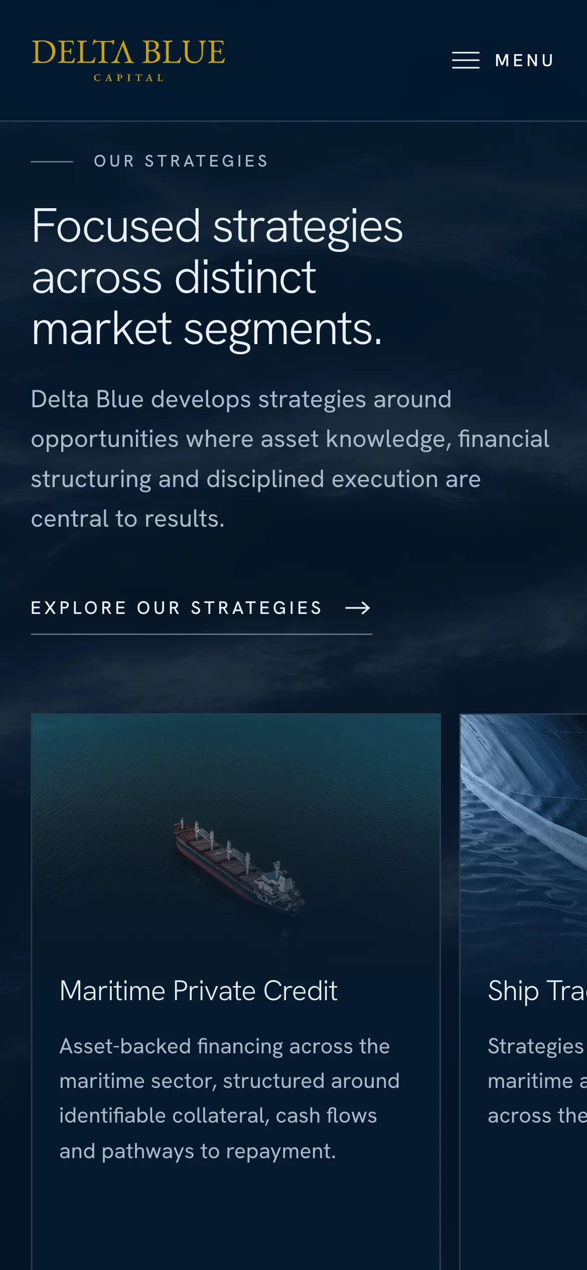
Ten pages, hand-written. Six plates from them.
Type
Hanken Grotesk and nothing else, with headings at its lightest weight. No serif and no monospace.
Colour
Navy and gold is what this category always wears. Here gold appears as the client's own logo and as one two-pixel edge. Everything else is paper, ink and navy.
Consent
The consent notice keeps one answer in the browser and nothing else. The site sets no cookies.
Legibility
Text that sits on a picture was measured at phone, tablet and desktop widths. The front page's headline reads at 4.9 to 1 on its picture before any darkening is added.
Ownership
Hand-written HTML, CSS and JavaScript, no framework. The domain, the code and the hosting account are all in the client's own name.
Approval
The firm's own approver signs off the wording of every page before it goes live.
It's been a pleasure working with you, and we'd be happy to recommend your services to anyone looking for a reliable and capable web designer.
Thank you for all your hard work on the website. We're happy with how it turned out.
We appreciate the creativity and thought you put into the design, as well as your willingness to accommodate our feedback and adjust throughout the process. You were responsive, patient, and attentive to the details, which made the whole experience very smooth.
Beyond the design itself, we also appreciate your technical expertise and the effort you put into ensuring the website was functional, easy to navigate and straightforward for us to manage going forward.